
Logo-folio 2017
I have applied my own personal brand colouring to all my logo designs below to make a visual point. Whenever I design a logo or symbol, I always try to make it as versatile as possible for every conceivable iteration of it’s use. A logo that can be used with almost any colour combination in any scenario. I don’t rely on colour tricks or the latest effects when designing. I always strive to come up with something that is clear and visually appealing. Representing the brand, its mission and vision accurately.
Jason Yourell Graphic Designer
They say as that an artist, you yourself are your own hardest critic.
That is so true! When I finally decided to create my own logo, I spent weeks drawing lots of shapes and symbols, testing them with friends and family before I chose this one to represent my own personal brand.
I like this logo, I really like the more 3D version of the logo that you can see up in the top corner of the website. The thought process behind it’s design starts with the fundamental shape of my initials “JY”. I wanted to create a type of metaphorical prism that represented concepts coming in from one side on the left, and creative colourful ideas emerging from the other.
Emerald Bow Strings
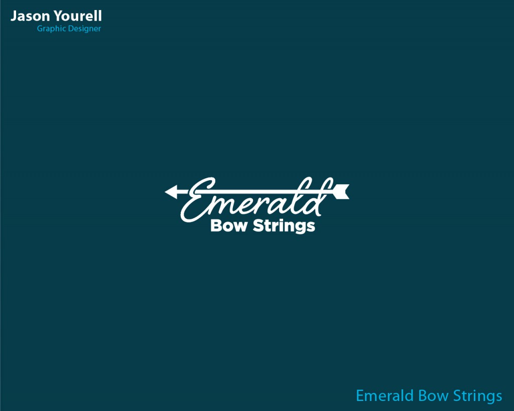
Emerald Bow Strings is small start up specializing in creating archery bow strings for compound, traditional and Olympic recurve archery bows.
I created this logo linking two key elements of archery, the arrow and the string itself. I did this utilizing a calligraphic script style wrapping the type round the arrow symbol, as it passed through the loops of the
E, L, and D.
Guerilla Interiors
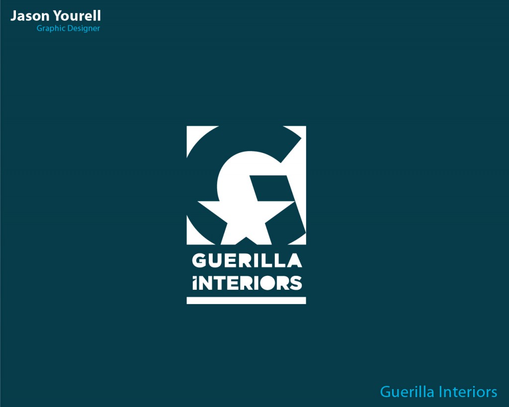
Guerilla Interiors were a co-op of specialist carpenters, tilers, architects, and designers offering the cutting edge in custom modern interiors design. They wanted a logo that represented their unique talents as a group, something to set them apart from all other interior designers.
I looked their competitors. At a lot of guerilla art with its hidden meanings, anarchic symbols and artists like Banksy. Then I took pencil to paper and over a few different sketches came up with this logo. The star in the middle sets the focal point. It also splits the G and forms the I on the right hand side.
I carried this split in the I over into the name below to connect it to the symbol and took out the center of the letters R, A and O to give the impression of a graffiti stencil. I found that the line below added a balance to the overall shape and decided that the logo was good enough!
Finished designs here >
Liberty Entertainment
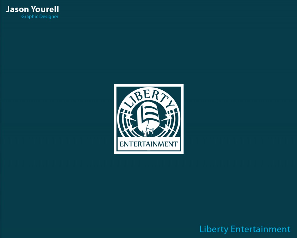
Liberty Entertainment is a Dublin based company supplying the very best in all aspects of entertainment service. From private functions to DJ’s for hire, pub and club shows, quizzes and much more.
I was asked to a create a logo that encompassed the wide spectrum of services they provided in one dynamic shape. I looked at Liberties competitors, got a feel for the various styles surrounding that business niche and I started to sketch.
I eventually settled on and old condenser microphone as the root shape of the logo. Then used the L and the E of Liberty Entertainment to make up the shape at the centre of the microphone. I placed the lightning bolts either side to balance it and chose a strong font to accompany it and frame the shape above and below.
Finished design here >
Heritage Tiling Ltd.
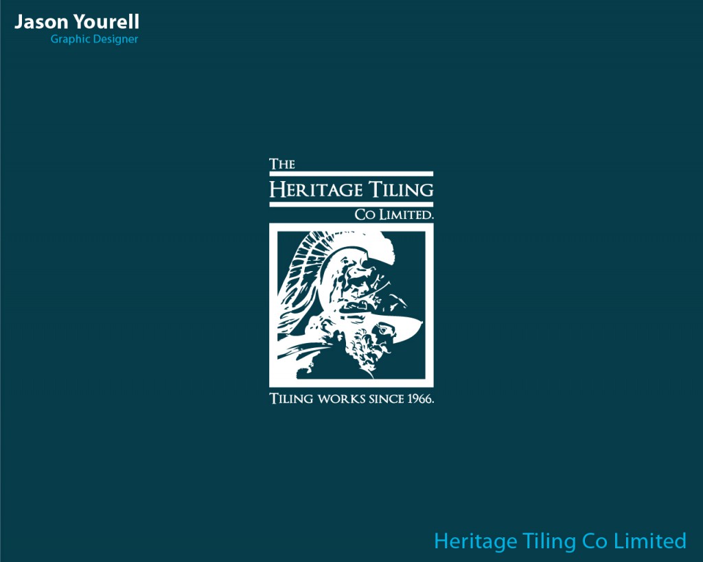
Heritage Tiling are a professional family run tiling business since its establishment in 1966. Working in a wide variety of areas of construction
offering the highest standard in service to commercial and domestic clients around Ireland.
They asked me to create a logo website and business card that would reflect a their premium brand. With clients like Google and Ernest & Young, I knew that theses visual elements were going to have be to reflect a level of professionalism, history and excellence.
I had several meetings with the MD, John Paul O’ Connor during the process. At the first meeting we discussed his design likes and dislikes. Their competitors, the goals of the company, and the demographic the were aiming their business at. John had stated that he always liked the Greek mythology and in particular Menelaus, the King of Sparta. So after I got a feel for the brand that they were trying to establish I went to work doing a little research. I created a rough draft of a design and showed it to John. After a couple of minor changes we eventually settled on the design above. I then integrated it into their business card design and website. Now it’s on their vehicles, uniforms and stationary!
Finished designs here >
Operation Transportation
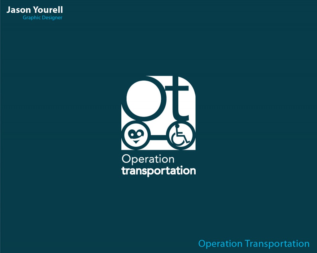
This was a fundraising project for St. Annes School for children with special needs in the Curragh. They were trying to raise money to buy and modify a new school bus suitable for transport of children with disabilities. I was contacted by the organizer Lorraine Higgins and asked if I could help with designing a logo and social media assets for their Facebook, Twitter and go fund me pages.
The inspiration for the shape came from the bus itself. In the wheel on the right I used the iconic wheelchair/disability symbol placed where the driver would be. Then the wheel on the left I added the heart with a smiling face to convey a friendly emotive element. The O and T of Operation Transportation sat above the two elements giving the virtual bus shape its form. Lorraine loved the logo and from its launch, the campaign raised over €30,000 towards their goal.
Finished designs here >
Leave a Reply